Conversion Lessons from the Best Converting B2B Websites

High converting websites do a number of things well – they engage users, inform them and lead them to sign up for offers, services or more information. If you want to know what your website could be doing better to improve conversions, why not take tips from some of the best-converting websites on the internet? We think that these B2B websites are definitely doing plenty right when it comes to converting visitors into customers.
Hubspot
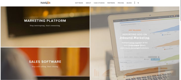
To put it simply, Hubspot's website is beautiful. With a simple interface that makes navigating easy. What more could a visitor want? Well, the homepage is easy to scan, with each element enjoying its own space, and you'd be hard pushed to scroll to the bottom without feeling compelled to click on an item. We love that the homepage includes links to download resources, as well as customer feedback, brief descriptions of the services on offer and multiple calls to action. One thing that sets Hubspot apart from their competition is that visitors must enter their data before downloading resources – this helps them to keep in touch with leads. Their blog is regularly updated with fresh and relevant content, and the addition of a call to action on each blog post, normally directing visitors to download a resource, boosts conversions.
HootSuite
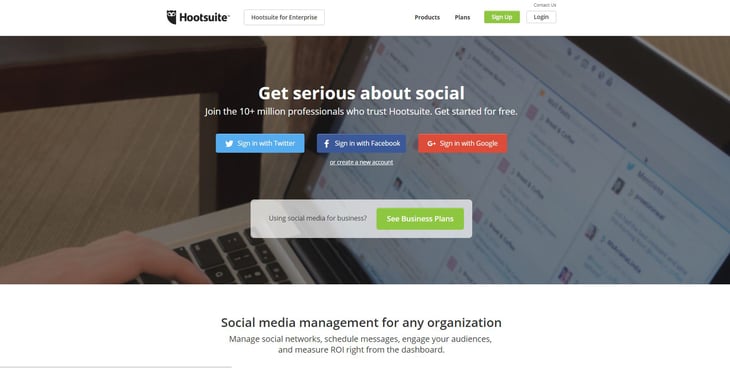
HootSuite's homepage is far from copy heavy, but it's most definitely simple and clear. It includes a list of their main clients as well as some information explaining the service they provide. A handy feature allows users to sign in using their social media accounts on the homepage, which speeds the signup process. Four large buttons across the bottom of the homepage – 'Engagement', 'Analytics', 'Collaboration' and 'Security' allow users the option to click and expand each section, to see an outline of key benefits. The point of the simple yet effective layout is to get visitors started using the platform – and it works!
PGi
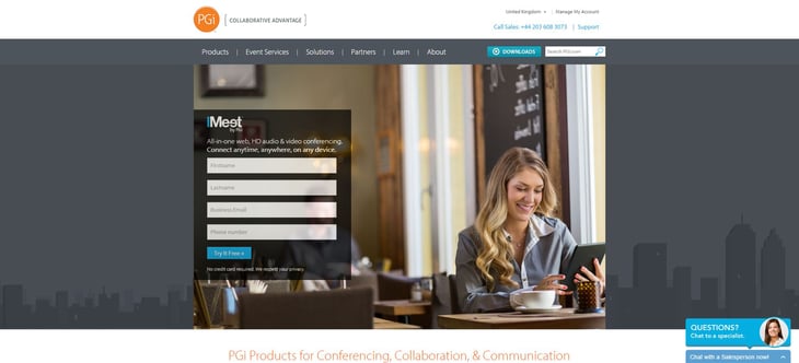
At first glance their site's homepage may look sparse, but PGi have created a graphically eye-catching site. There are four call-to-action buttons at the bottom, a link to their iMeet product and a couple of relevant informational videos. Couple this with appealing offers, such as an e-book, and it's easy to see why this is such a high converting B2B website. Users are prompted to fill out a form with their details in order to receive downloads, generating and nurturing leads for the company.
Marketo
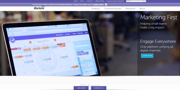
Marketo's simple yet effective page design is enhanced by the use of a light background with deep purple highlights. Straightforward copy, an elegant logo and a clear, easy to scan layout helps users find what they are looking for, fast – no mean feat considering the site is content-heavy. The three floating buttons that appear on all the pages, labelled, 'contact us', 'free trial' and '4 min demo' are designed to stay at the bottom of the browser window until you scroll down. Clicking each button opens a unique landing page in a new tab. We love the detailed content, clear layouts and beautiful graphics of Marketo's site, which helps to build trust and credibility with users. If only every B2B site looked this good!
DOOR3
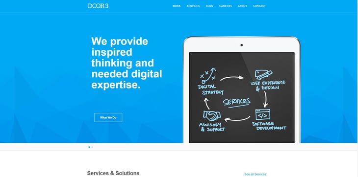
Proof that sometimes simple really is best, DOOR3's site features a simple homepage which includes information about the business solutions and services they offer, previous clients and links to their blog and 'about us' page. By clicking 'Learn more', users land on a page listing the company's services. Each service page has a link reading 'Unravel your most challenging knots' or 'Follow the road to success' – engaging copy, we think you'll agree! These links lead to a contact page. Effective use of layouts, space and photos means that DOOR3 are able to present a lot of information effectively. If your business needs to convey a lot of information, taking tips from them on layout and style is definitely worthwhile.
You can learn a lot by looking at the websites of your competitors, or from other high-converting B2B websites that have mastered the art of creating an effective site. The tips and tricks they use to increase their conversions can be applied to your company's website, and you'll reap the benefits.

