
Your website is often the first port of contact with a company or brand, therefore getting the web design right is more important than ever before. A good first impression is vital, so a high quality site is imperative.
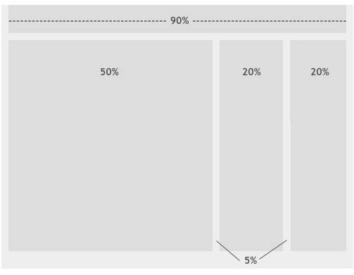
Although the main design decision comes down to the users' needs, the site owner's requirements, and the sort of content that will be included, many website developers and designers opt for a fluid web design. This is an approach that uses percentage based widths rather than pixels, as shown in the diagram below. This design style adapts to different screens and devices, enabling the site to stretch up and down to fit the page when resizing the browser window.
 Source: Smashing Magazine
Why Should Your Website Be Responsive?
There is an endless list of reasons why a responsive website is the way forward and why this could be the difference between a successful business and an unsuccessful business. The first being that over 20% of Google searches are performed on a mobile device, and 25% of US residents only access the internet via smartphone. An element of responsiveness is having a high page speed, something a website definitely should have! If your site takes a long time to load there is a very big chance that users will click off, giving you a high bounce rate and low conversion rate. Furthermore, 55% of social media consumption happens on a mobile device, meaning that if website links are shared, for example via Twitter, that is a lot of people that are going to be clicking OFF your site if it's not responsive.
Why Use A Fluid Web Design?
Ethan Marcotte coined the term 'responsive web design,' a category in which fluid web design falls under. Fluidity is where sites use the same percentage of space no matter what screen you're viewing, meaning it adjusts to the user's setup. The idea is that the amount of padding, also known as white space is similar between all browsers and screen resolutions, which can be more visually appealing. One of the key advantages to fluid web design and why it is a good approach, is that it reduces horizontal scrolling on smaller screens.
Fluid Web Design Limitations
Although a fluid web design provides many benefits to both a business and its user, it also comes with the odd limitation. Some that can easily be overcome, and others not so much.
What may look good on a small desktop might look completely different on a larger screen. The designer will soon learn that they unfortunately have little control over what the user sees, and may also miss or overlook problems that don't show up on their screen but do on others'. Content such as images and videos may need to be set with multiple widths to adapt to different resolutions, therefore prolonging the planning element of the build as you have to foresee problems such as this that may occur. Also, if there isn't enough content, in the case of a very large screen being used, the aesthetic of the website will be heavily damaged.
Here are a few other articles related to Web Design that you might be interested in:
- 4 Signs Your Website Is Outdated
- Why Website Speed Is Important
- Why Website Design Matters For B2B Businesses
Hopefully this article has helped you understand Fluid Web Design a little more and its purpose. If you have any queries, please comment below or call us on 01332 343281 for an informal chat.